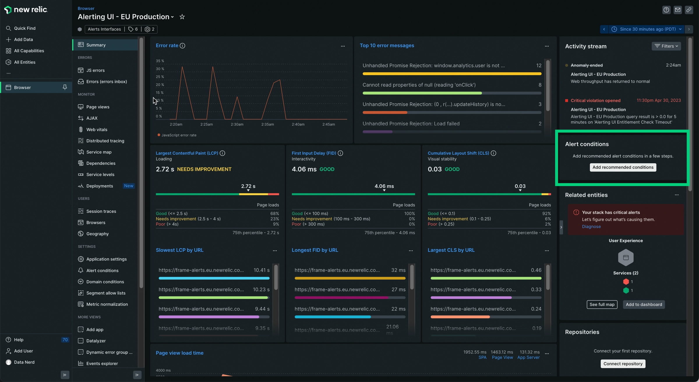
Our Summary page helps you troubleshoot issues with the real user browser performance of your app. Use the Summary page to:
- Get core web vitals at a glance, including largest contentful paint (LCP), first input delay (FID), and cumulative layout shift (CLS).
- View trends in an app's browser-side performance.
- Quickly troubleshoot page load timing issues.
- Go directly to other browser UI pages to examine problems and issues in more detail.
- Add recommended alert conditions.
View the Summary page
To view a summary of a browser app's performance:
- Go to one.newrelic.com > All Capabilities.
- Click Browser
- Select a browser app.
Use core web vitals data to improve SEO
Use the Core web vitals charts to understand how your browser performs according to Google's Core Web Vitals. These include:
- LCP: Largest contentful paint, which measures loading performance
- FID: First input delay, which measures interactivity between user input and browser response
- CLS: Cumulative layout shift, which measures visual stability in the browser page
Higher scores can help your organization save money and influence SEO. Lower scores can affect your users' perceptions of your organization's website, which could result in dissatisfied customers or lost business opportunities.
To learn more about monitoring core web vitals, see our Guide to core web vitals.
Evaluate user experience
In addition to the charts with core web vitals data, evaluate your users' experience with your app by using the following data:
- User time on the site
- User-centric page load times and Longest first input delay by URL: To get more details about the page load timing process, click the chart's title to go directly to the Page views UI.
Locate browser performance problems
Use these charts to help identify performance problems that are related to the browser:
- Initial page load and route change: This chart shows the load time of a traditional URL change stemming from a load or reload of a URL. To get more details, click the chart's title to go directly to the Page views UI.
- Throughput: This chart shows browser throughput as pages per minute (ppm). If applicable, this chart also shows single-page app (SPA) data. To get more details, click the chart's title to go directly to the Page views UI.
- Page views with JavaScript errors: To get more details, click the chart's title to go directly to the JS errors UI.
Examine issues caused by something else
Performance problems may be related to the browser, or they may be related to something else. To get more details about other issues that may be affecting browser performance, examine the following:
- Frontend vs. backend: This chart links to the connected service application. To get more details about distributed traces, click the chart's title.
- First interaction by device type (desktop, tablet, or mobile) and First interaction by user agent: To get more details, click the chart's title to go directly to the Page views UI.
- Related entities: This widget can help you determine whether performance problems may be caused by issues with entities that have connections to the browser.
- View synthetic monitors: Synthetic monitoring can simulate user traffic. This link can help you proactively detect and resolve outages and poor performance related to critical endpoints before your customers notice.
Add recommended alert conditions
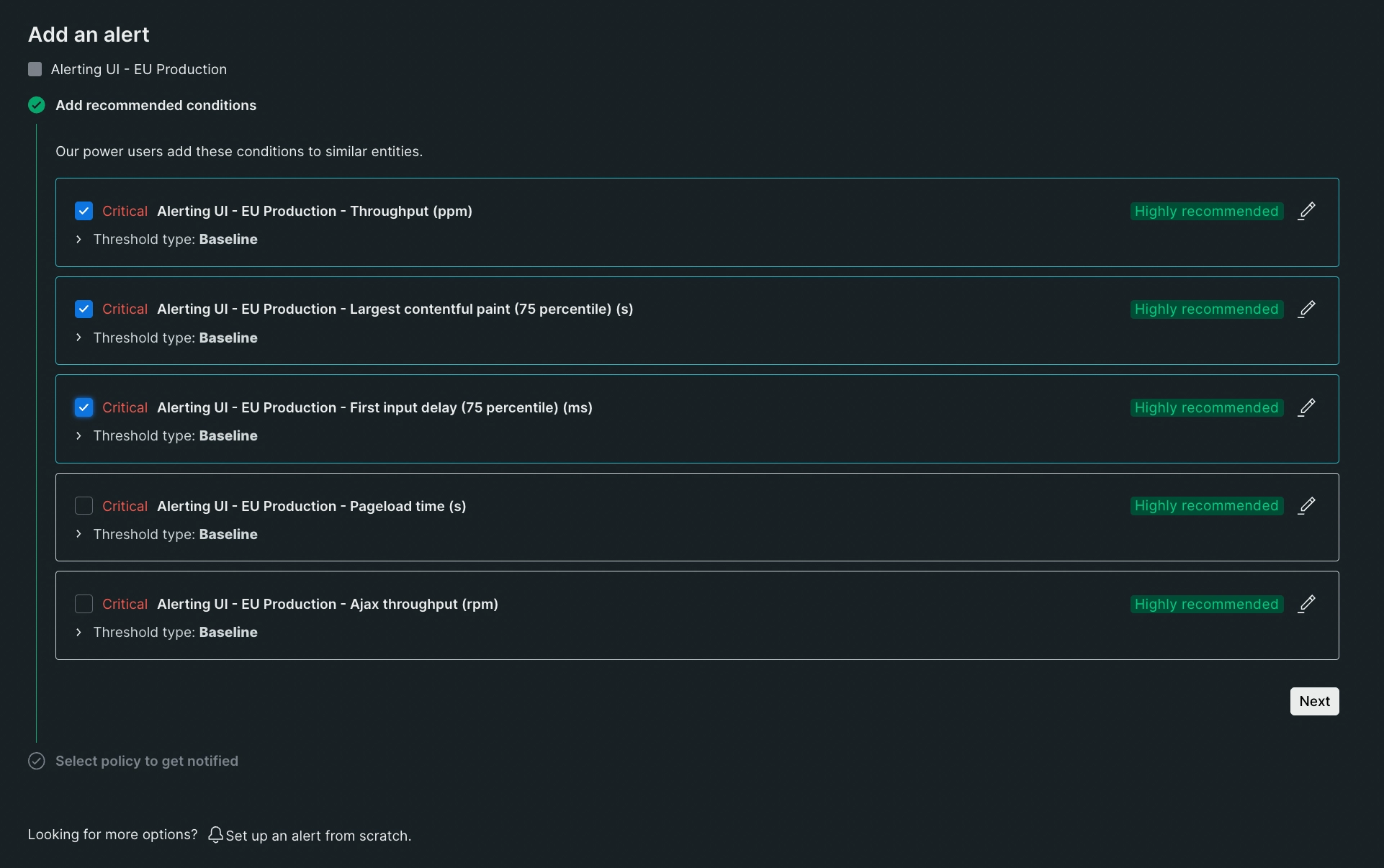
Through the browser monitoring Summary page you can add recommended alert conditions to your entity.
See the Alert coverage gaps and condition recommendations page if you want to see more uncovered entities.
Follow these steps to add recommended alert conditions:
Open the browser monitoring Summary page.
Click Add recommended conditions.

Choose a number of recommended alert conditions.

Click Next.
Select a policy to get notified. You can select an existing one or create a new one.
Click Activate conditions.